A few months ago Art Technology released a new range of E Ink watches, called Phosphor watches. Now they have released a new model (black case Digital Hour), and have kindly send us one for review. The watch is now available for 190$.
 |
 |
The watch
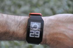
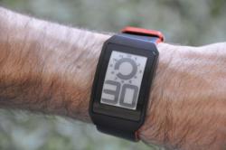
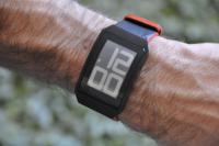
The Digital Hour watch is a curved, light-weight watch. It's not thin, though, which is surprising because the display itself is very thin (more on this later, but it's under 400 micron thick!). The watch functions are pretty basic: you can view the time (in two modes: analog/digital combined, and just digital), the date, and there's also an alarm you can setup. The watch is always in 12-hours mode (no military time).
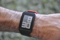
There are two buttons: one is used to flip between the 4 display modes (analog/digital time, digital time, date and alarm setup). The other button is used to flip the display between white on black or black on white. The two buttons are also used to setup the watch. You can see the analog/digital mode above, and here are the other 3 modes (from left to right: digital time, date and alarm). You can tell it's the date mode because of the small icon on the top-left.
 |
 |
 |
At first I was rather confused, as I didn't find the manual (it's rather hidden inside the case...) and I wasn't sure how to setup it. It's not easy to see the difference between the date and time displays, for example (I didn't know what that small icon on the top-left means). Luckily I did find the manual at the end.
Here's a short video showing how the watches changes from black-on-white to white-on-black, and also all of the 4 modes. You can also note the rather long time (3-seconds) it takes the watch to change modes (more on this later).
The E Ink display
I was mostly interested in the E Ink display, of course. This is a thin (under 400 micron!) segmented E Ink display made entirely out of plastic. It's black and white (or, rather gray and white), which looks great under all light conditions, and in direct sunlight it looks the best. It does not have a back-light, however, so you cannot view it in the dark.Â
One of the nice things about this display is that it looks very different from other displays. In fact, it doesn't really look like a display at all. People keep asking me whether this is a real watch and are surprised when the time changes or when I change modes. Cool!
One of the problems of E Ink is the slow refresh rate. When you switch a mode it takes about 3 seconds, and the watch just 'flashes' when this happens. It's annoying at first, but I find that I do not really do this very often. You can see this flash in the video above.
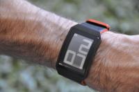
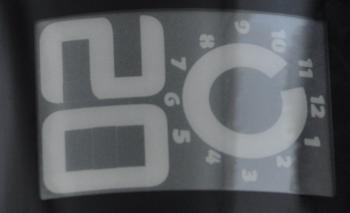
Another interesting and somewhat annoying thing is that sometimes the 7-segment display seems to 'remember' the old letters, and some lines are still seen even after a letter changed. Look at the following picture closely, you'll see two lines in the middle of the zero letter.Â
Design and People's reaction
So this is a watch, obviously, and keeping the cool E Ink display aside, it's a matter of taste whether you like it or not. I walked around with it for about a week, and asked lot's of people what they say about it.
So first of all, it gets a lot of attention. People are curious about the display, how it works, and I found myself explaining E Ink and E-readers and tiny-capsules to a lot of people. This was rather fun. About the design itself - most people didn't like it. It is very minimalistic - the watch itself is rather plain, just a black bezel around the display (the word phosphor is written in black on the bottom, you can hardly see it), and a nice black leather band with an orange stripe (they also sell this watch with a metal case and band).Â
What do I think
When I first looked at the watch in pictures (on the web) I didn't like how it looked, to be honest. When I first opened the box, I was pleasantly surprised - it looks much better in real life. And the more I wear it, the more I like it. In fact at first I said I was just gonna wear it for a week to do this review, but I think I'm gonna keep it!
Some people didn't like the analog/digital display mode. I personally do (although I do not care so much for the other modes), but why not add more display types? or different fonts? In fact, it seems that much more can be done, design-wise, with such a neat display. I got a lot of "so what can it do?" questions. I could only asnwer "well, show the time", which is a shame. I hope that in future watches they'll add more features. While they're at it, I think it can be thinner, too...

